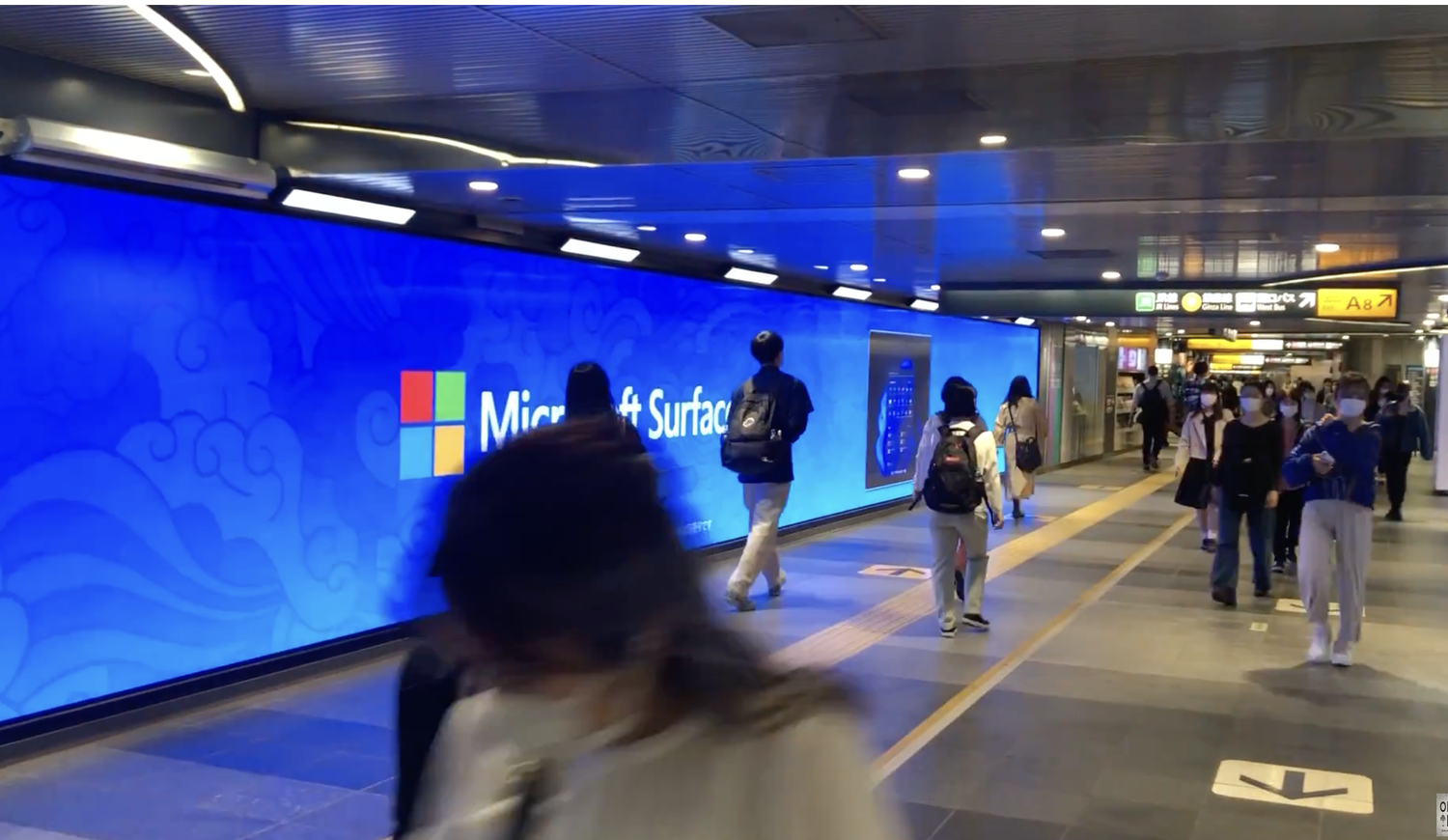
Led design for Microsoft’s international Surface Pro 8 launch around the idea “Stand Out.” In collaboration with Japanese artist Daisuke, we created a visual world spanning digital, broadcast, and out-of-home.
Agency: Panay Films
Client: Microsoft
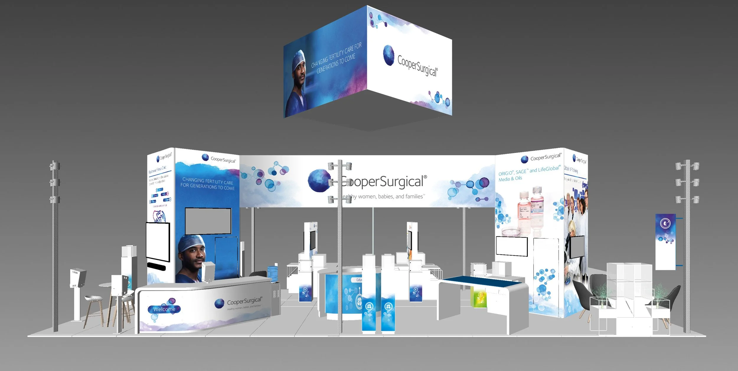
Booth designs and marketing materials for several trade shows.
The Challenge
Shift4 had acquired Shift4Shop and wanted to introduce both brands on the world's biggest stage. Together with SpaceX, the mission would become the first all-civilian flight to orbit Earth while inspiring a nationwide fundraising campaign for St. Jude Children's Research Hospital.
The Ask
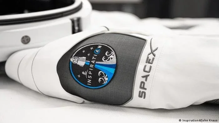
Create a unifying brand identity for Inspiration4 that could live across every touchpoint—from the mission patch and custom typography to the website, social campaign, merchandise, and launch communications—while capturing the optimism and ambition of the historic mission.
Solution
I developed the visual identity and design system for Inspiration4, built around four aspirational pillars—Hope, Prosperity, Generosity, and Leadership—that guided the mission and represented each crew member. The system included a custom wordmark, mission patch, bespoke typeface, color palette, digital experiences, social content, and branded collateral for both Inspiration4 and Shift4. The campaign helped raise nearly $250 million for St. Jude Children's Research Hospital while introducing one of the most inspiring commercial space missions ever launched.
#BrandIdentity #Typography #LogoDesign #SpaceX #CreativeDirection #DesignSystems #Packaging #DigitalDesign
Art Direction for various clients.
UX Research & Design, UI Design, Art Direction for Advertising
Agency: Phenomenon
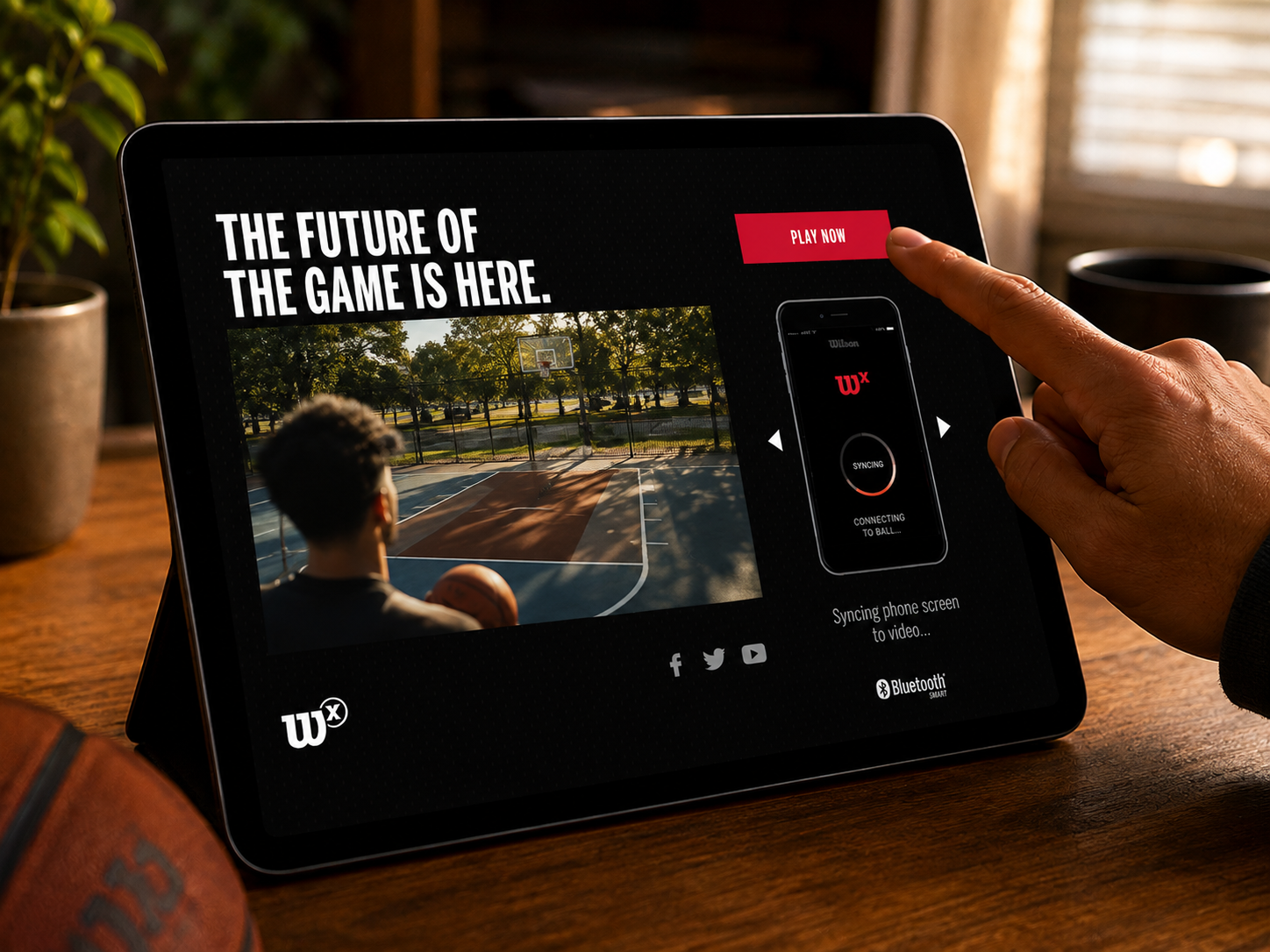
Client: Wilson Sporting Goods
The Problem
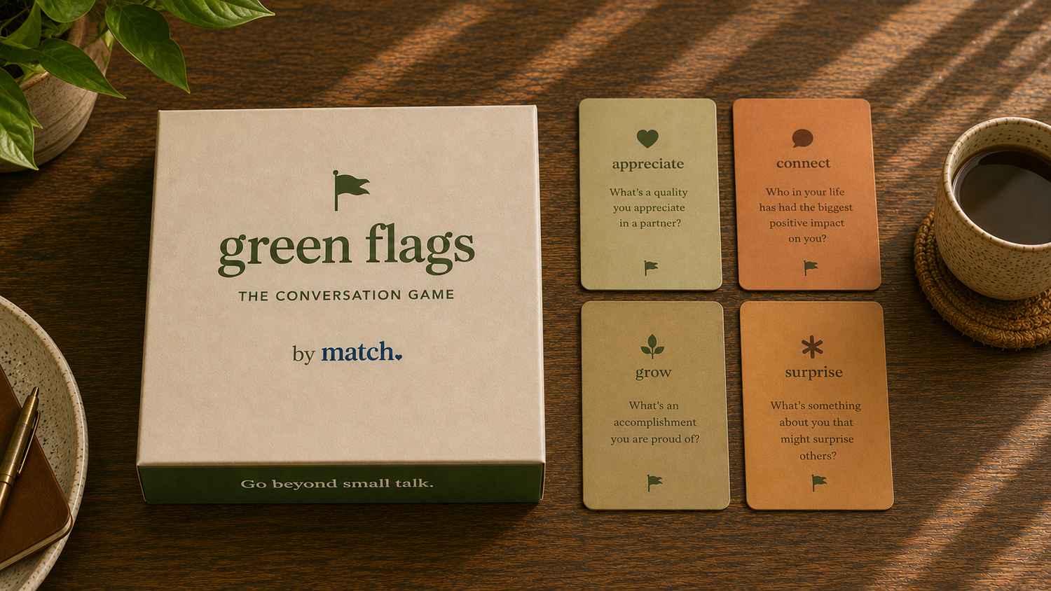
Dating conversations revolve around red flags, ghosting, and swipe fatigue. Match needed to give people a fresh reason to believe in dating.
The Ask
Shift the focus to what’s worth celebrating through a social campaign and a memorable experience beyond the screen.
The Solution
Green Flags celebrates positive relationship behaviors through relatable social content. Partnering with a writer, I designed a premium conversation card game that brings the idea offline—something people can gather around, play, and keep.
The Next Step
As the concept evolved, we saw a stronger opportunity: a speed-dating event where the cards spark meaningful conversations and guests take the game home, extending the experience beyond the evening.
Agency: Mocean
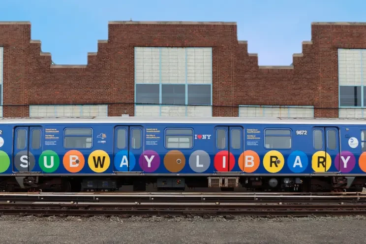
Transformed an NYC subway train into an immersive library experience, bringing the NYPL’s iconic interiors to life through a cohesive visual world. The takeover connected environmental storytelling with digital discovery, inviting riders to download free eBooks using the MTA’s new underground Wi-Fi.
Pulsar Advertising · New York MTA
Associate Creative Director / Designer
Featured in The New York Times
Featured in The New York Times
“Be on the lookout for a train with 10 subway cars that have been covered in bright blue, purple, green, orange and yellow.
The train — which is alternating between the E and F lines in Brooklyn, Manhattan and Queens — is decorated with the words “SUBWAY LIBRARY.”
Inside those 10 cars, the seats resemble books on a shelf.
Beginning today, the Subway Library will offer commuters six weeks of free downloadable books from the city’s public libraries.
But you don’t need to be in a library car to take advantage. When you enter a subway station, connect to the Transit Wireless WiFi network available at all underground stations. When you’ve logged on, you’ll see a prompt for SubwayLibrary.com, and — voilà — you can start browsing and downloading books, short stories, chapters and excerpts donated by publishers to the New York Public Library.”
The Problem
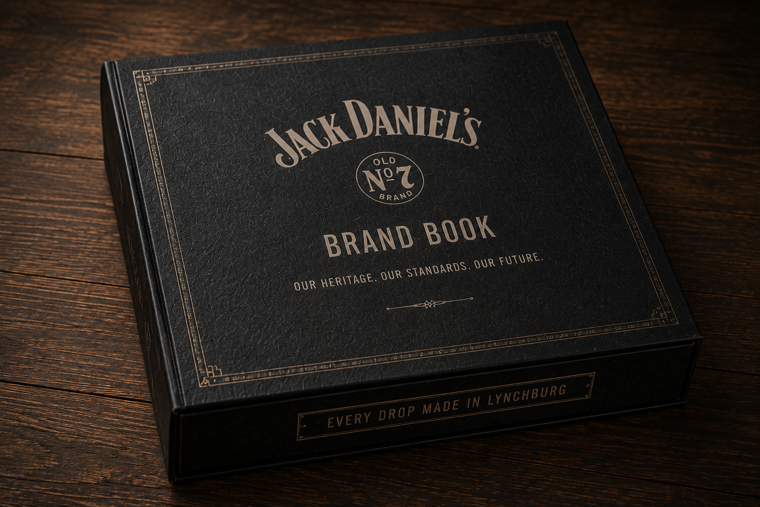
Arnold Worldwide approached IAAH to create a premium brand book that captured the authenticity of Jack Daniel's while establishing a timeless editorial system for agency partners, internal teams, and future brand stewards.
The Ask
Design a hardcover brand book and presentation box that celebrated more than 150 years of craftsmanship through typography, photography, materials, and storytelling.
Solution
created a custom editorial system inspired by woodblock lettering, vintage distillery ephemera, and traditional letterpress printing. The experience extended beyond the book into a premium presentation box that houses both the brand book and an iconic bottle of Old No. 7, transforming the identity guidelines into a collectible brand experience that feels as authentic as the whiskey itself.
Agency: IAAH
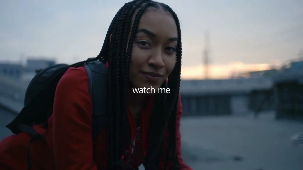
Microsoft Copilot launched with our “Watch Me” campaign that ran during the Super Bowl and across channels. We later introduced an app-specific visual identity that used the Microsoft 365 ecosystem. As the product matured, we refreshed the campaign with a cleaner, premium aesthetic while preserving its recognizable design system.
These frames were from my pitch to refresh the design direction.
I aided in the design for both the launch and refresh, developing a scalable visual language used across digital, social, web, and out-of-home campaigns.
Agency: Panay Films
Client: Microsoft
Agency: Panay Films
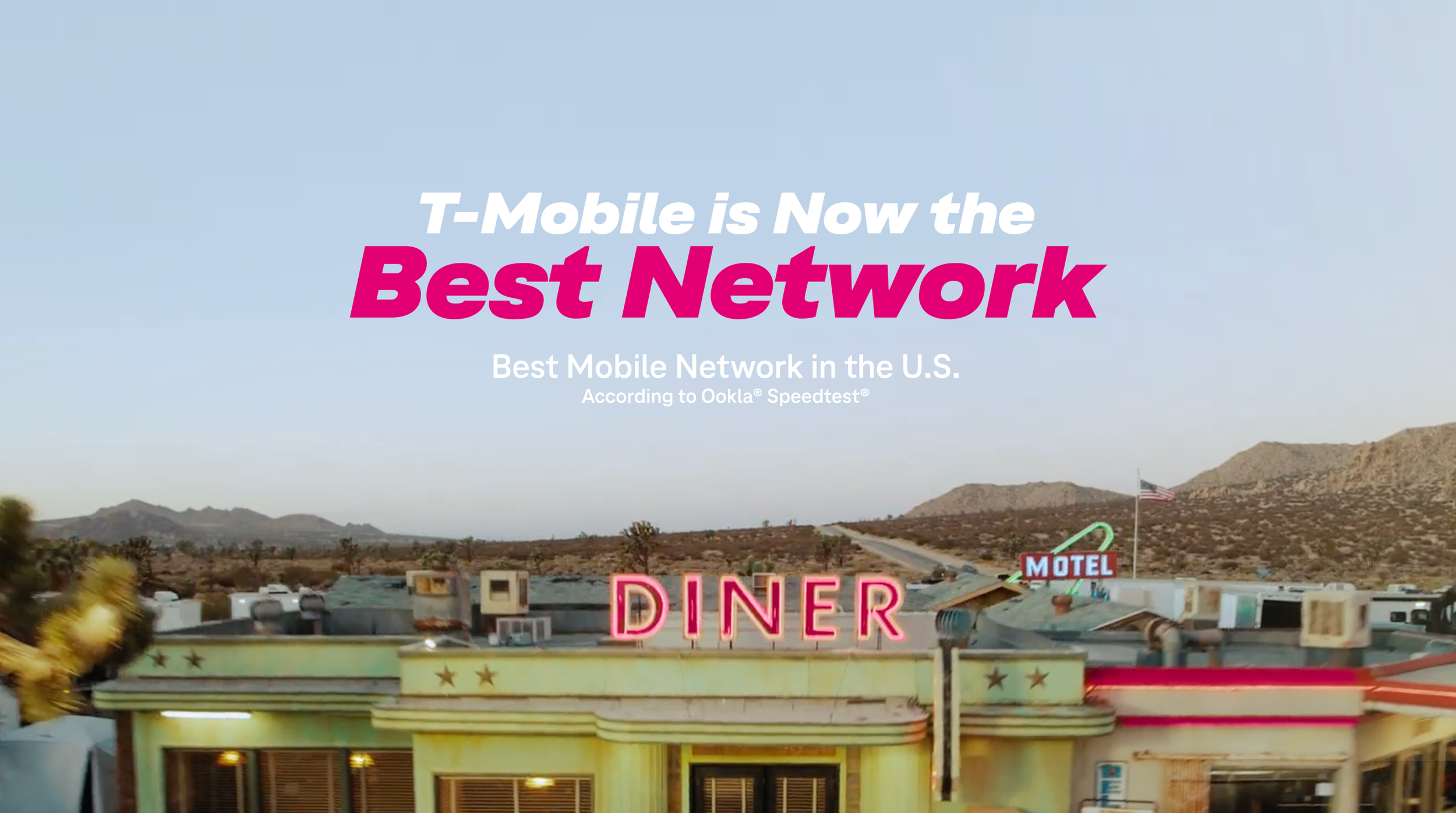
Client: T-Mobile
Role: Lead Designer
Problem
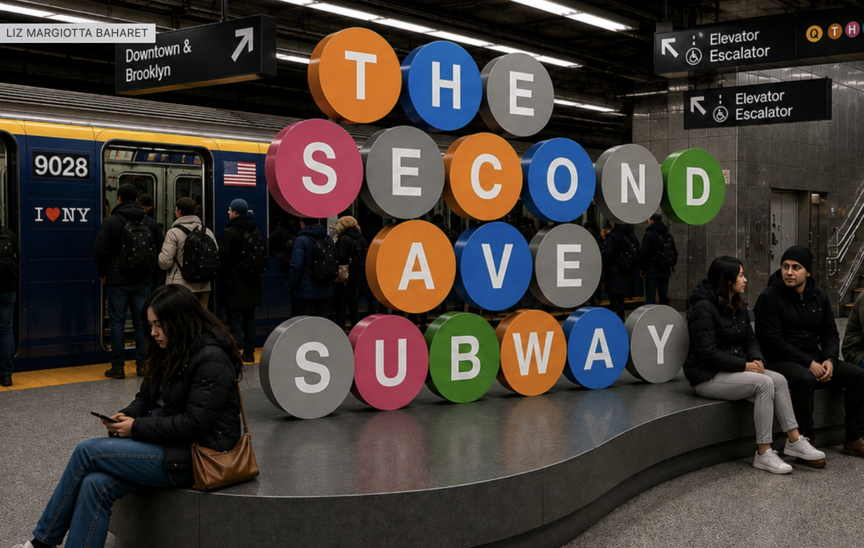
Turned the Second Avenue Subway opening into a citywide celebration, building a bold visual system from the MTA’s iconic route symbols. The campaign brought one creative idea across train wraps, station environments, outdoor advertising, and merchandise—including a Kate Spade New York collaboration and sculptural station seating.
Pulsar Advertising · New York MTA
Associate Creative Director / Designer
+
Featured in The New York Times
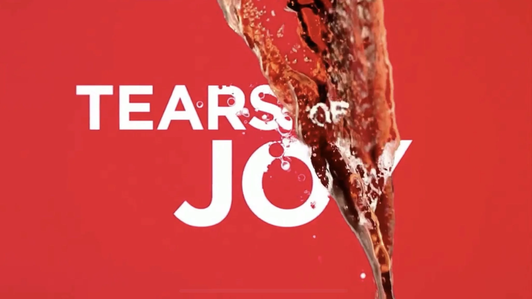
Embark on a delicious typographic journey through these typographic CocaCola commercials.
Company: Elastic
Agency: Weiden & Kennedy Portland
Client: CocaCola
Role: Art Director / Lead Designer
LINKS TO VIDEOS
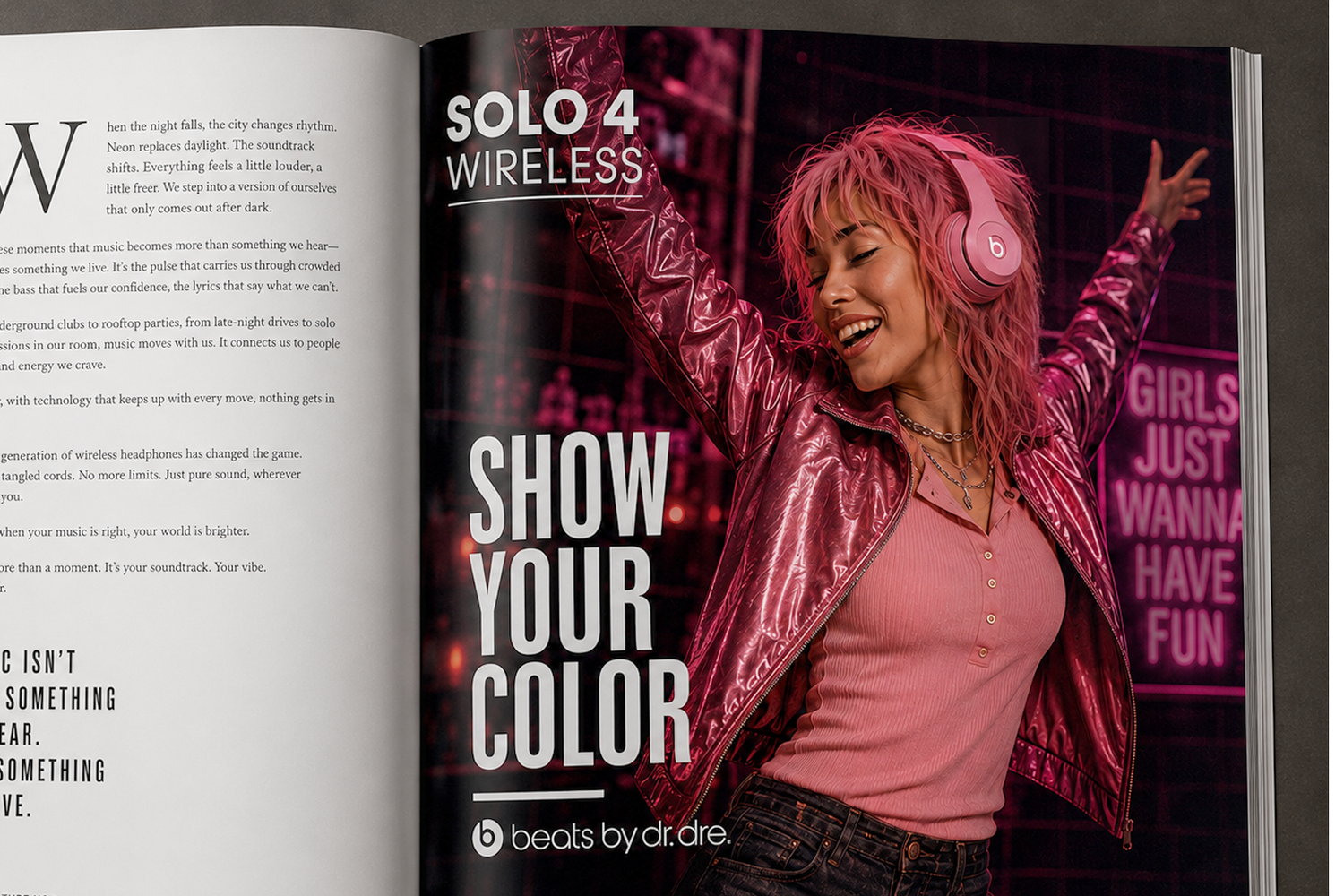
Solo 4 Campaign Pitch - Creative Director
The Problem
Beats Solo has always been as much about personal style as it is about sound. With Solo 4, the opportunity was to introduce the freedom of wireless listening while reconnecting the product to the individuality and cultural energy that made Beats famous.
The Ask
Launch Solo 4 Wireless with a campaign that communicates the freedom of going wireless while celebrating the different people, places, and sounds that define how we listen.
My Solution
I reimagined “Show Your Color” for a new generation, building a portrait-driven campaign around the freedom to take your music anywhere. From bluegrass on horseback and jazz in a late-night club to zoning out on the subway or dancing in a crowded room, each image captures someone completely immersed in their own world.
Color, styling, environment, and Solo 4 work together to give every portrait its own identity, while a consistent visual system connects the campaign across print, OOH, and social.
Here is a selection of both client and personal typographic work. From film titles and promos, to commercials and posters, my type skills are well rounded, and typography is the favorite part of my job.
https://www.boldandbowl.com
My first published book “G is for Garden” is now for sale on AMAZON
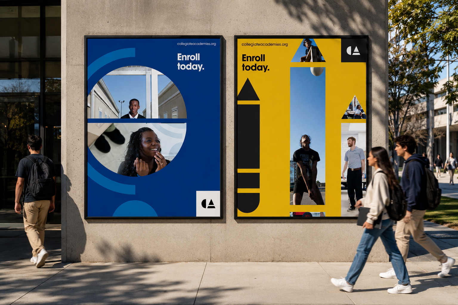
Collegiate Academies wanted to get the word out about their network of high performing public schools. We created a campaign based on a simple system using modular icons. Those icons framed candid photos of students to help educate local families about CA.
Website
Company: IAAH
Client: Collegiate Academies
Role: Designer
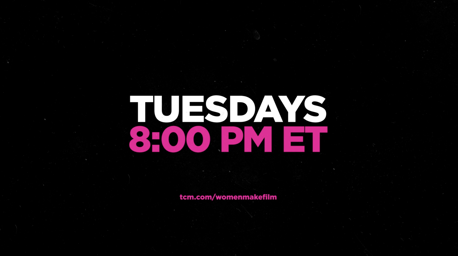
Our team crafted a captivating :60 promotional spot and a comprehensive network toolkit for a 14-week event, showcasing the documentary series Women Make Film alongside a film festival.
In our pursuit to highlight the profound impact of female directors, I spearheaded the creation of not only a broadcast toolkit but also compelling digital and social promotion material for the campaign. This cinematic journey involved seamlessly flying past cutout imagery from various films, presented in a vibrant z-space, thereby creating a visually engaging and immersive experience for our audience.
Agency: Known
Client: Turner Classic Movies
Role: Design Director
Featured in Rolling Stones Magazine
Helped create a bold visual identity for the Art Directors Club’s Young Guns 9. A custom “Young Guns” wordmark and gritty punctuation-based textures connected the print and digital campaign, winners’ book, and event environment. We designed exterior signage and interior graphics that brought the identity into the space, creating a cohesive experience from arrival through the celebration.
The project received notable acclaim and was featured in the Communication Arts Typography Annual.
Agency: IAAH
Client: Art Directors Club
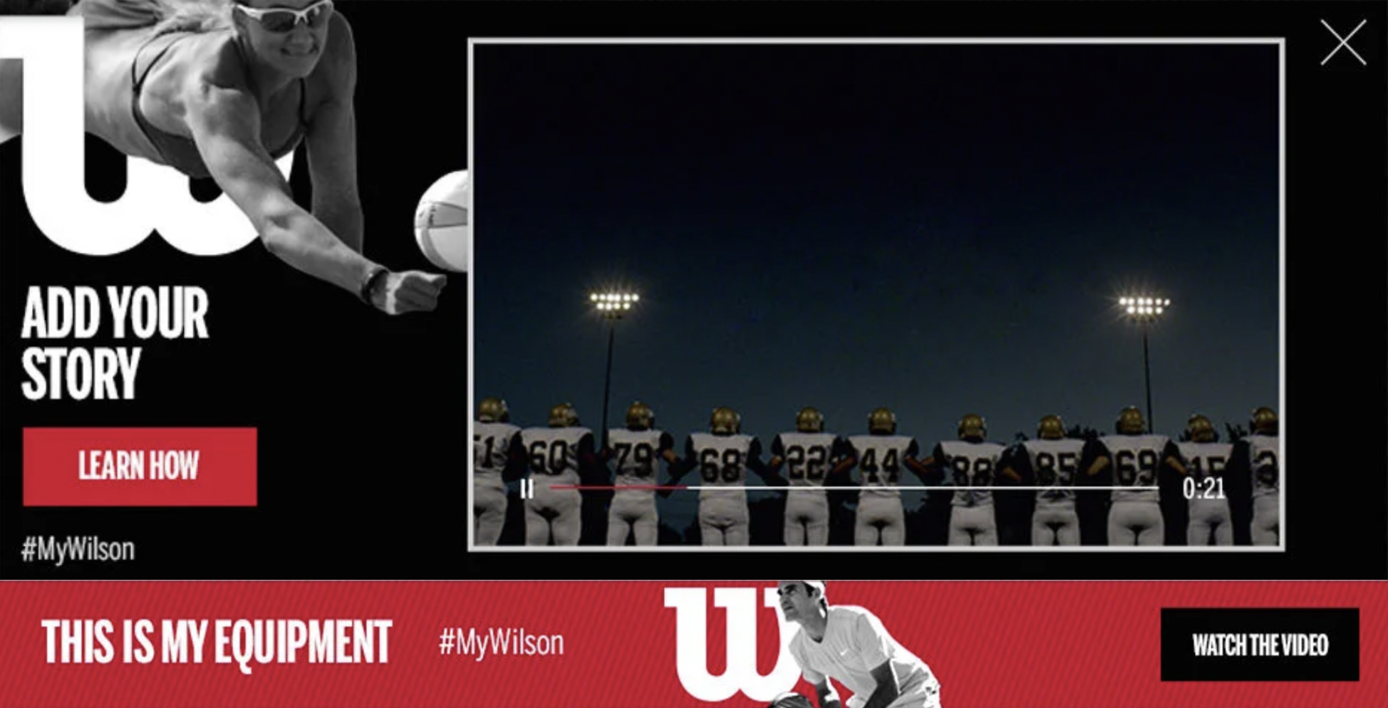
#MyWilson
The Problem
Wilson wanted to strengthen its connection with athletes by reminding people that the most important piece of sports equipment isn't just what helps you play—it's what carries your story.
The Ask
Create a social-first campaign that united professional and amateur athletes around a single idea: What does your Wilson mean to you? The experience needed to inspire user-generated content while celebrating the emotional bond between athletes and their equipment.
Solution
I helped develop the creative for the #MyWilson campaign, where world-class athletes and everyday competitors shared the personal stories behind the Wilson gear that shaped their journeys. A hero film launched the campaign across social and digital, inviting athletes everywhere to join the conversation by sharing their own stories.
To extend the idea beyond the screen, I also concepted an immersive pop-up experience that transformed sports equipment into a gallery of personal stories. Visitors could watch short films about the gear used by legendary and everyday athletes, then contribute their own story—turning the installation into a living archive of the emotional connection between athletes and the equipment that helped define them.
The Problem
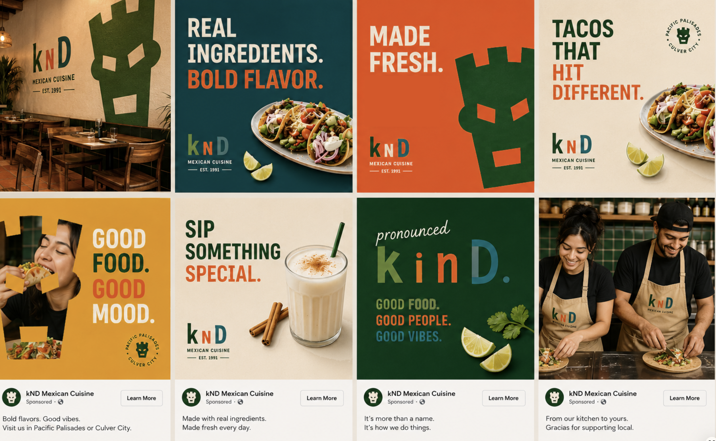
After more than 30 years in business, Kay n' Dave's had built a loyal following, but its identity no longer reflected the quality of its food. The brand felt dated and inconsistent across every touchpoint, from signage and menus to packaging, uniforms, and social media.
The Ask
Refresh the brand from the ground up by renaming the restaurant KnD (pronounced Kind.) and creating a cohesive identity system that could live across the restaurant, packaging, signage, merchandise, digital, and social media.
Solution
I transformed Kay n' Dave's into KnD, a modern identity built around the idea that great food begins with kindness. A custom mask icon, vibrant color palette, and bold typography created a flexible brand system that extends across menus, packaging, uniforms, murals, environmental graphics, social campaigns, and restaurant interiors. The result is a cohesive, contemporary brand that feels approachable, memorable, and distinctly Southern California.
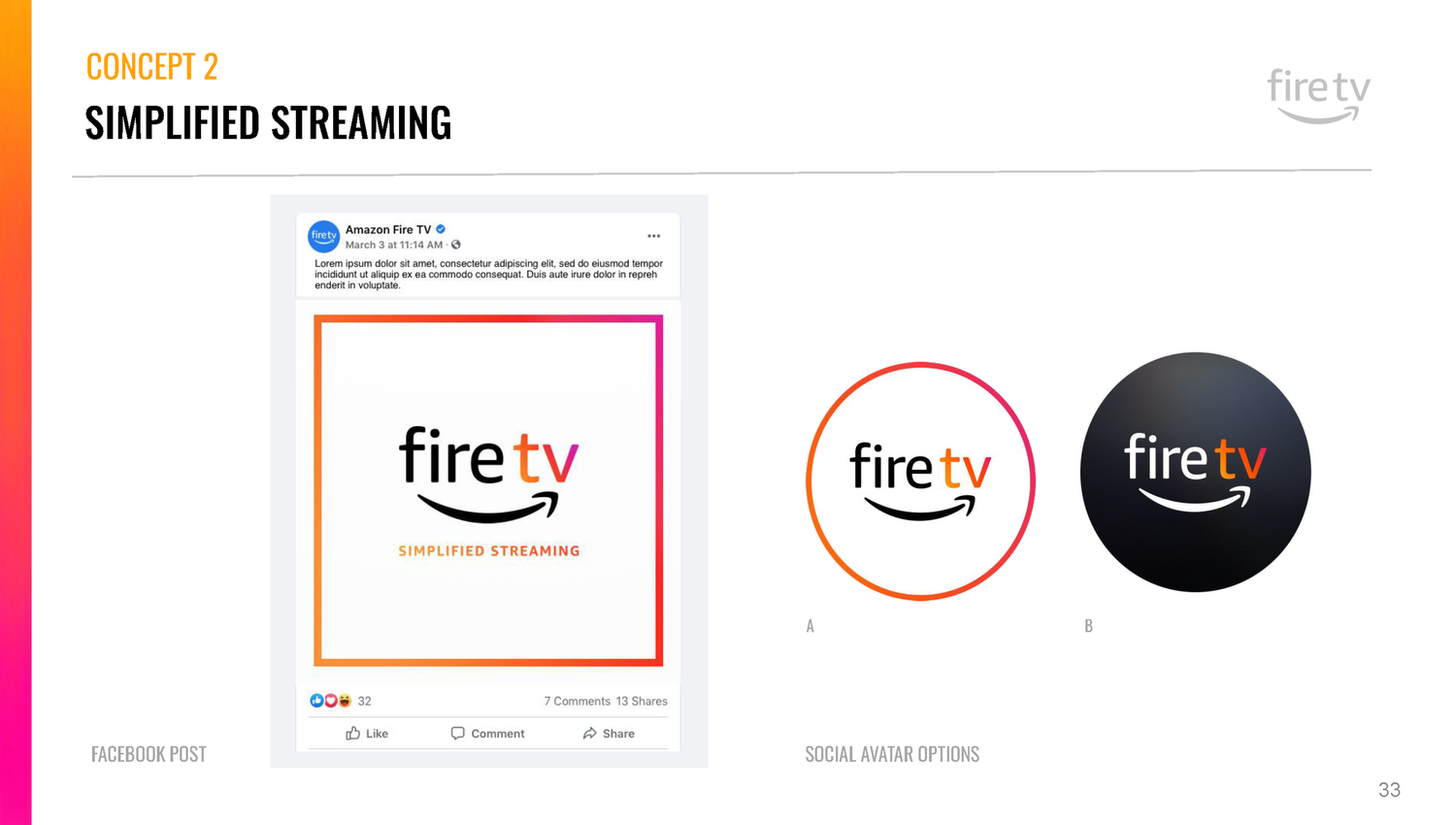
Designed to be an incredibly compact streaming device, the Fire TV Stick connects to your TV's HDMI port and gives you access to favorite apps including streaming services.
Our job was to position the brand within the media player and console space, and deliver a beautiful brand, custom gradient and corresponding assets that would stand out.
Roles: creative direction, brand design, strategy
Agency: Known
Client: Amazon FireTV
Role: Art Director
Directed by Kyle Cooper, the American Horror Story Coven title sequence was centered on witches, voodoo, and Marie Laveau's haunting history. We pushed the boundaries to create a chilling viewing experience that delved into dark and macabre themes, leaving viewers on the edge of their seats.
This was a team effort with several designers working in collaboration, but my roe was lead Art Director and worked directly with Kyle Cooper on and off set.
Client: FX
Company: Prologue
Role: Art Director / Designer
Each year, Google unveils a highly anticipated film and microsite, revealing the most searched topics and pressing questions that have piqued people's curiosity. I had the privilege of contributing to this project, playing a crucial role in editing and progressing the captivating stories showcased in the film.
Additionally, we aided in design for an immersive microsite that delved deeper into the trending topics.
Client: Google
Agency: 72&Sunny
Role: Art Director
I led a rebrand and toolkit initiative for ESPN E:60. To capture the essence of traditional investigative journalism, we utilized vintage photography techniques in our design approach. Elements such as a light table and film transparency were incorporated, creating a seamless transition between footage and imagery. This creative choice perfectly conveyed the spirit of the live broadcast and emphasized the importance of in-depth reporting.
Company: Prologue
Client: ESPN
Role: Creative Director / Motion Designer
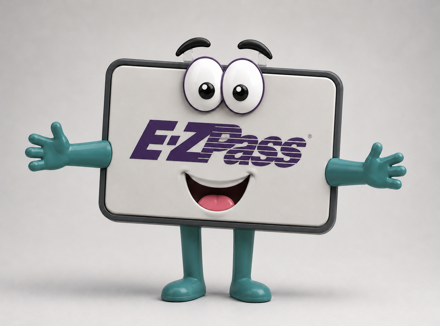
E-ZPass Mobile Alerts
For a Valentine's Day campaign, I created the concept "I'll Text You," turning Mobile Alerts into a playful relationship between drivers and E-ZPass. I led the creative direction, designed the integrated advertising campaign, and created a collectible bendable mascot toy that brought the campaign to life across print, digital, social, and promotional touchpoints.
To promote the Heineken's sponsorship of the Champions League Finals event, we used a disruptive technique to capture attention. With 20 seats and 20 tickets scattered across two vibrant cities, our mission was to create a buzz.
The promotional spot showcased an intense competition as the highly sought after Finals tickets were cleverly hidden in Rome and Milan. Participants faced a thrilling race against time, with just one hour to track down their lucky seat. This concept added an element of excitement, encouraging viewers to join the quest for their chance to attend the prestigious event.
Agency: Chiat/Day NY
Client: Heineken Global
Copywriter: Tom Greenwood
Role: Creative Director
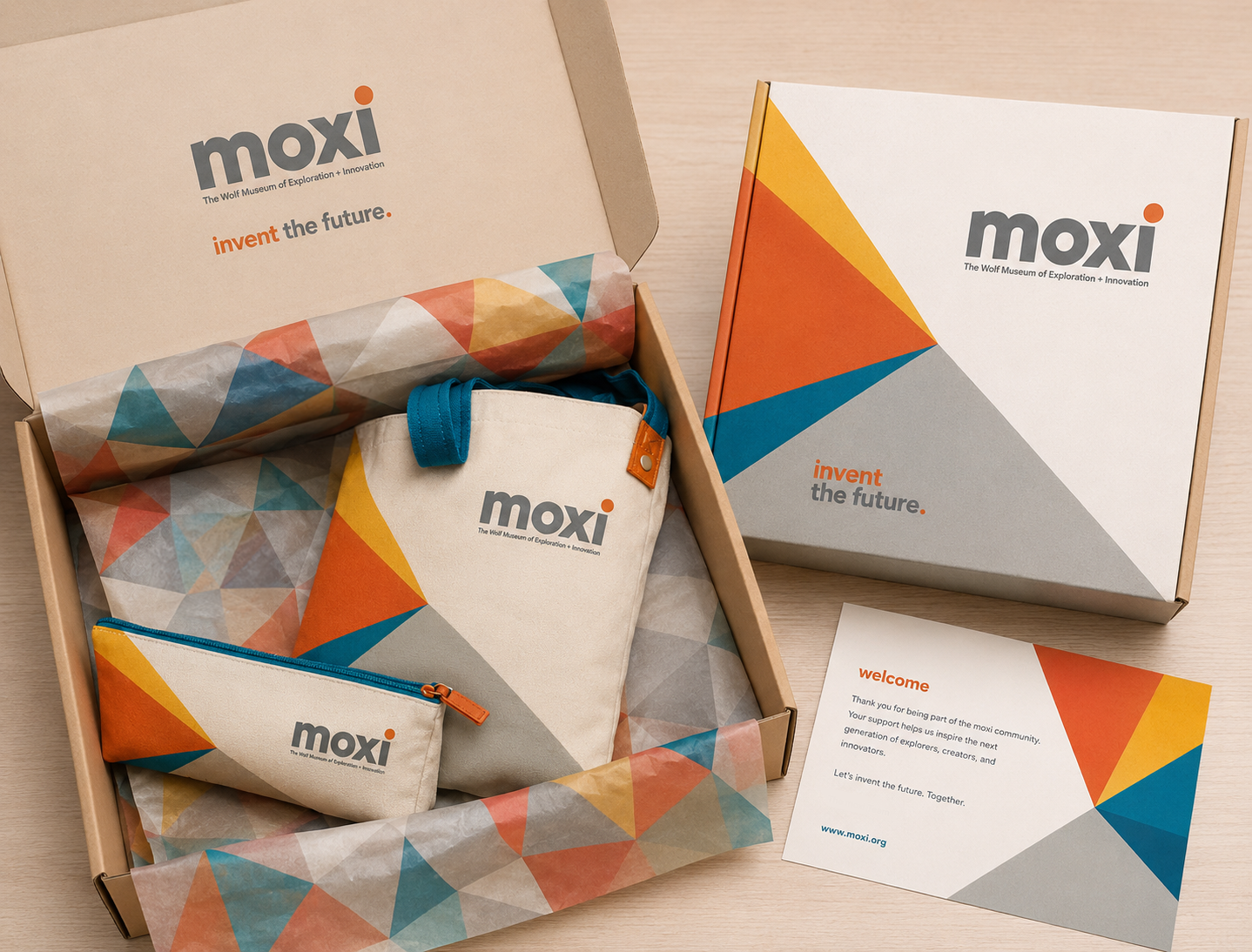
When MOXI, The Wolf Museum of Exploration + Innovation launched in 2016, it announced itself to the world as “a playground for your brain.” The brand collateral and website needed to represent them as such. We created a playful and colorful design to help brand MOXI as a children’s museum that appeals to curious minds of all ages. Later, I designed and directed a digital campaign that highlighted curios kids!
Company: loyalkaspar
Client: Moxi
Role: Art Director
To combat holiday season hunger, Bank of America launched an impactful public service campaign called Feeding America.
Through the creative, we used of hand painted lettering and illustrations on empty plates. These PSA visually portrayed the challenging reality faced by many Americans during this time of year.
With the generosity of countless individuals, the PSA successfully raised over $1.5 million, providing vital resources to address hunger.
Company: Prologue
Client: Bank of America
Role: Creative Director / Motion Designer
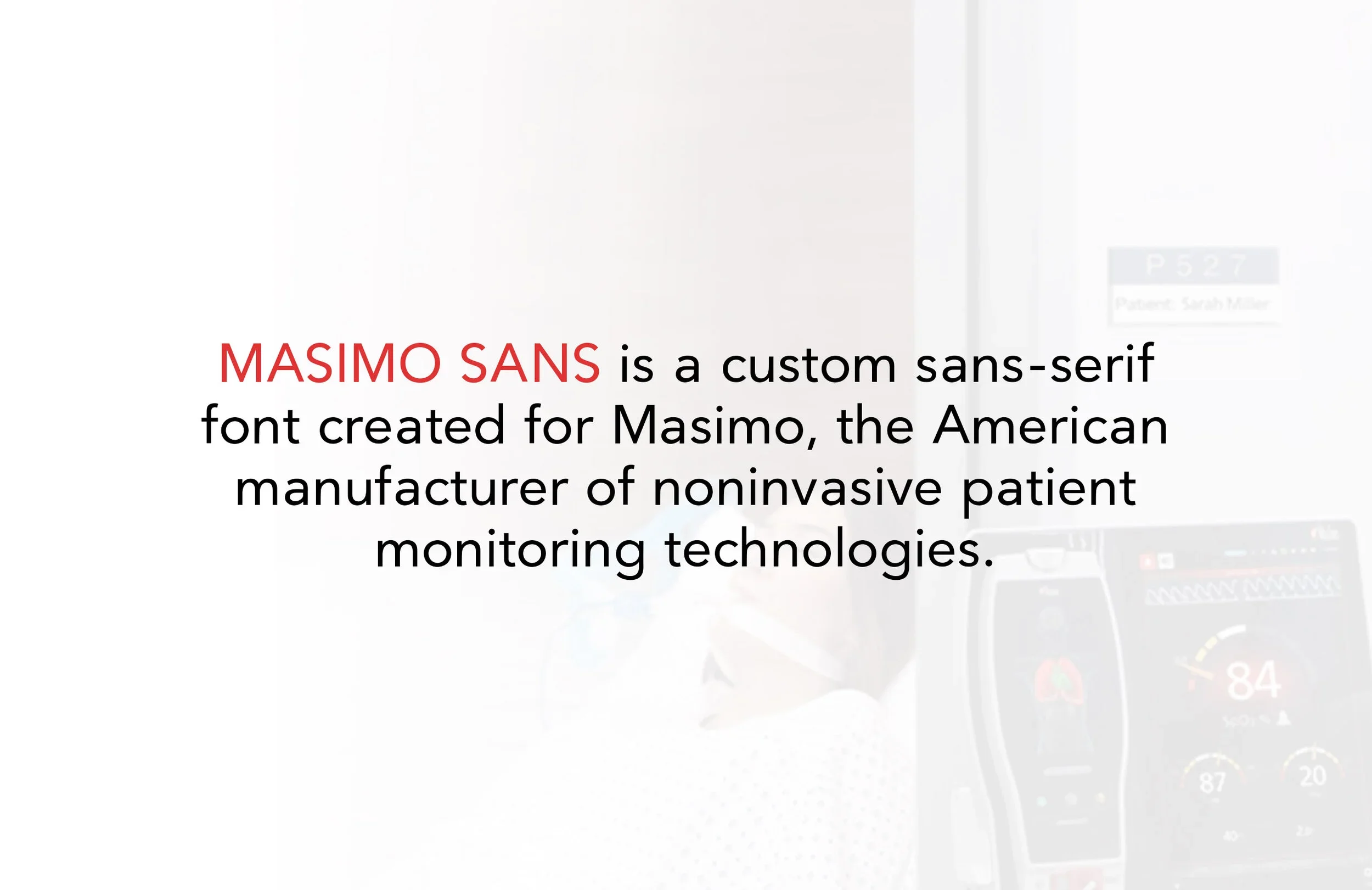
Masimo, a leading medical supplier, sought to establish a distinctive brand identity by commissioning the creation of custom sans serif fonts: Masimo Sans and Masimo Condensed. These typefaces were meticulously designed and developed over an extensive period of several months, ensuring a comprehensive set of glyphs, punctuation, language support, numerals, and various weights.
The development process encompassed careful attention to detail, ensuring the inclusion of essential characters and symbols required for effective communication in medical settings.
Role: Type Designer and Developer
Client: Masimo
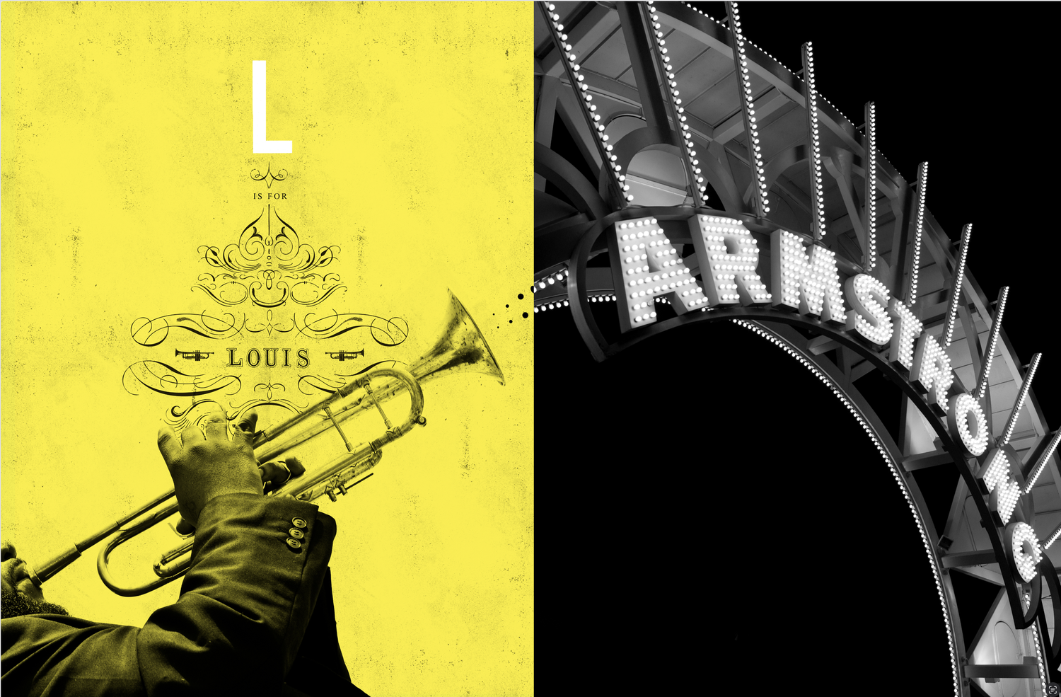
Love Letters From Nola was an exploration of New Orleans’ rich history and culture, explained from letters A-Z. It was the studio's personal project led by owner Ness Higson.
Company: IAAH
Client: Love Letters From New Orleans
Role: Designer
As the Art Director for TNT's latest mobster show promos, I infused the logo and messaging with a gritty texture to channel a film noir atmosphere. The teaser paid homage to the genre, featuring intense graphic scenes inspired by real-life mob killings. Leading the visual aesthetic as Creative Director, I designed a comprehensive branding package for the network. My contributions, including style frames and storyboards, aided Kyle Cooper in capturing the gruesome essence of the promos. Notably, we secured an exception in network television to depict blood on screen, adding a thrilling edge to the project.
Company: Prologue
Client: TNT
A personal series of collages inspired by the Blue Note album cover aesthetic and jazz music, specifically Bitches Brew by Miles Davis. From its repetitive notes to its kaleidoscope of scattered sounds, the album is experimental, and so are these collages.
I directed and produced this self-initiated, high-energy video urging us to discover our inner best. A collaboration with the filmmakers from The Greenhouse Collective, local athletes, friends, and a skilled videographer in Venice, California, we used a Sony FS7 camera to capture the scenic LA coastline. This project enhanced our video direction and production skills, delivering an inspiring message to pursue your passion.
Adobe Creative Class
Promotional video for Adobe
Studio: Prologue
Client: Adobe
Role: Art Director, Contributing Artist
We wanted to create an Anthem to creatives, something that would both recognize the travails and celebrate the accomplishments of our peers, creative people.